Hilton Worldwide Case Study
Housekeeping for a Reimagined “Millennial” Hotel Brand
Problem: With the launch of a new, reimagined “Millennial” hotel brand, Hilton needed to a fresh approach to their Property Management System (PMS) that, similar to the brand’s new strategy, focused on placing the experience very much in the hands of the customer. The previous 12 brands used software that was extremely outdated and simply would not work with the new brand concept.
Solution: By taking a fresh, user-centered approach to a bit of an experimental concept, there was an opportunity to break into a new kind of model for Hilton software and customer experience.
The goal was to explore and develop a new, conceptual PMS solution from beginning-to-end, focusing on the housekeeping workflow. This conceptual ‘pitch’ would be evaluated by stakeholders for the future direction of this brand (and others) and the software that supports it.
Background
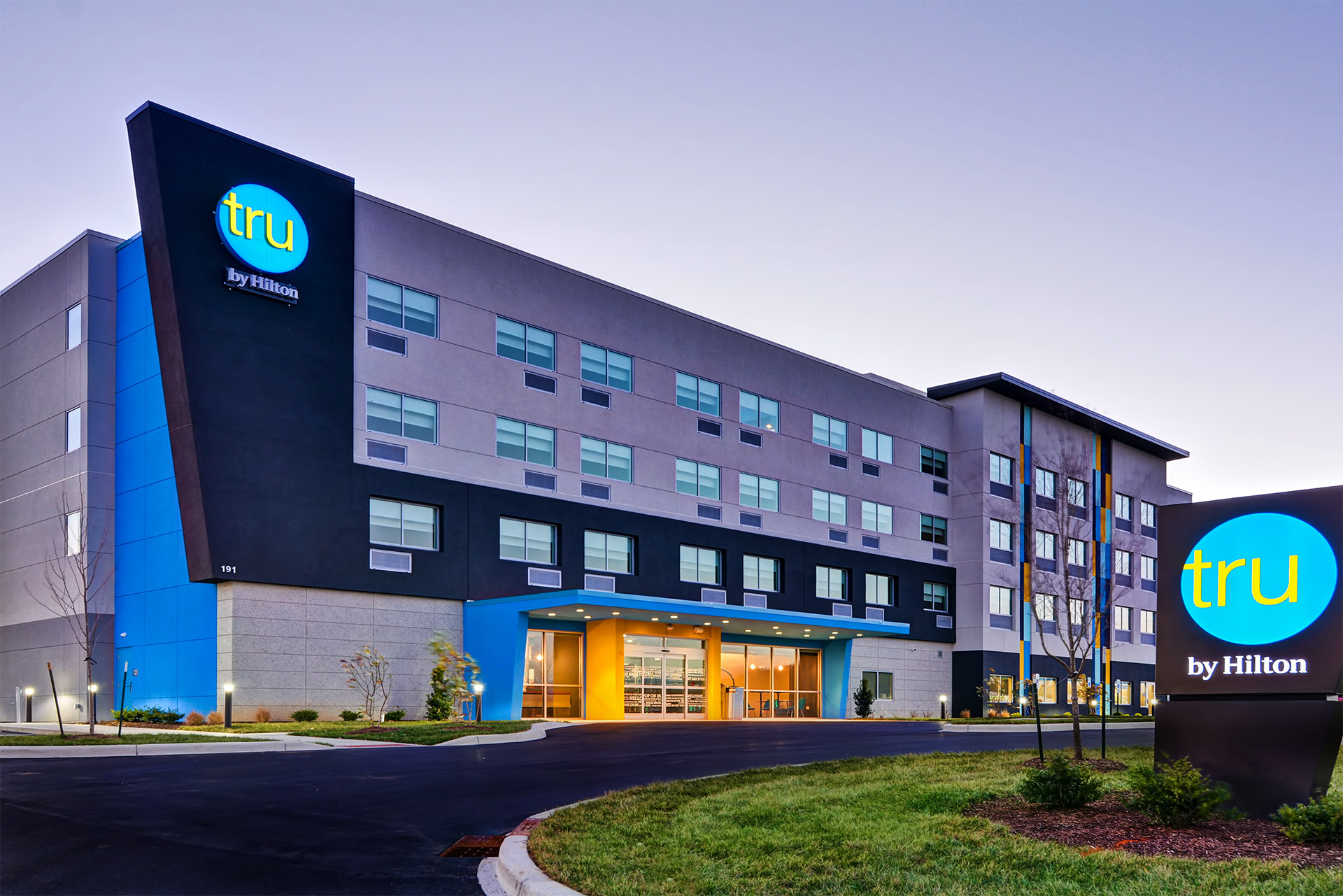
Hilton Worldwide had 12 different hotel brands with more than 4300 hotels worldwide. None of these brands, however, were resonating well amongst the “Millennial” age group. Tru by Hilton, is the newest brand, which was aiming to improve this gap with a different kind of approach than their other, traditional, hotel brands. A desk-less, almost hostel-like type of layout was used for a fresh new approach to investors. Similarly, the software used for this experience was all meant to be very customer-centric, whether it be a hotel guest or actual employees. The problem is that this wasn’t exactly something Hilton was very good at, previously using very dated software for other brands.
Research & Analysis
Initially, the first user problem approached for exploration was housekeeping. Given the business strategy and goals for the new brand, it would also include some conceptual exploration, moreso on the aesthetic, using this aspect of the PMS as a starting point. Regardless of the style exploration though, we first needed to do some discovery to learn more about housekeeping and the users that we would be solving for.
User Persona Development
In order to gain some perspective into the housekeeping users, interviews needed to be conducted in order to try and form some key user personas to focus on. Around 10-12 interviews were done, both remotely and in-person at nearby Hilton properties. A few personas emerged to be important to design for.
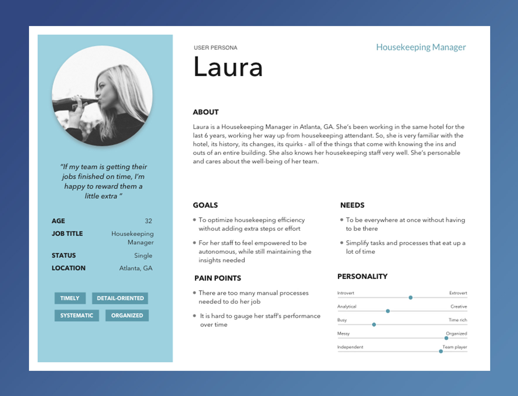
Housekeeping Manager
This is an example of one of the three personas that were developed for the housekeeping module. In this case, the housekeeping manager's character, pain points, needs, and goals of are captured to be used as a key point of reference during the rest of the design process.
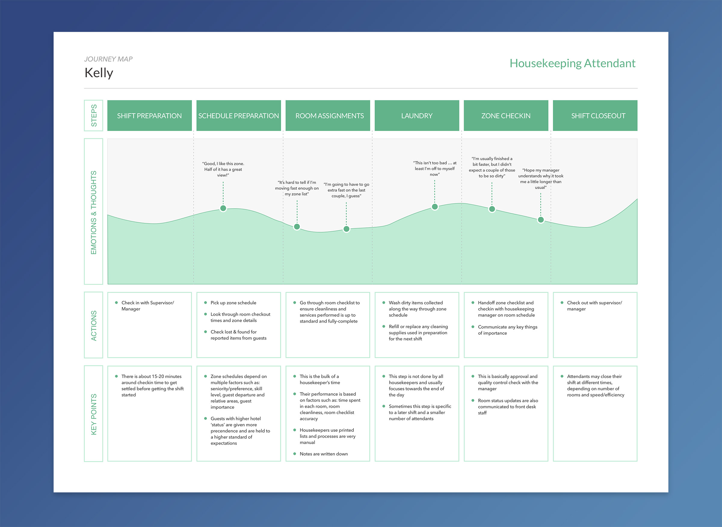
User Journey
After developing some user personas to reference, we wanted to try and get a more detailed sense of what their current workflow looked like. By doing this we could look to identify where exactly pain points and opportunities existed in their typical day-to-day schedule. One problem area was their 'room assignments' task. There seemed to be trouble balancing between room cleaning quality and time spent in any given room with just a printout of their schedule. This was also seemed to be a paint point/goal for the housekeeping manager.
User Needs & Business Requirements
While there weren't a lot of specific business requirements given the exploratory nature of the new brand and approach, two were clear -- digitize room entry and make it mobile. These were related somewhat to the nature of the new brand concept. The room entry aspect also had certain security and efficiency benefits as well, in moving away from any kind of physical key.
As far as user needs go, the key objectives from previous activities to focus on were:
- Time and performance tracking
- Zone cleaning efficiency
- General communication and operational insights
User Groups
One group would consist of housekeeping attendants and mainteance workers as they both had very similar needs and pain points. They both could benefit from streamlining and clarifying their schedule efficiency and personal performance. Given the relatively straight-forward workflows required, general on-the-go nature, and overall budget estimates, it made sense that they should use a mobile phone for the application.
The second group would focus on the housekeeping manager persona, and any other role that would ever need to use the housekeeping module with the same level of access. They would need to be able to perform any actions the first group could, but with additional or new features. Managers are also generally less mobile, so it should make sense this group would use a tablet device, or just a desktop computer.
Ergonomics & Human Factors
Given the mobile solution direction required, ergonomic and human factor best-practices were certainly considered here. After the key interaction-related user needs were identified, it was important to place some up-front emphasis on a couple aspects given the environment and way in which they would be using the application.
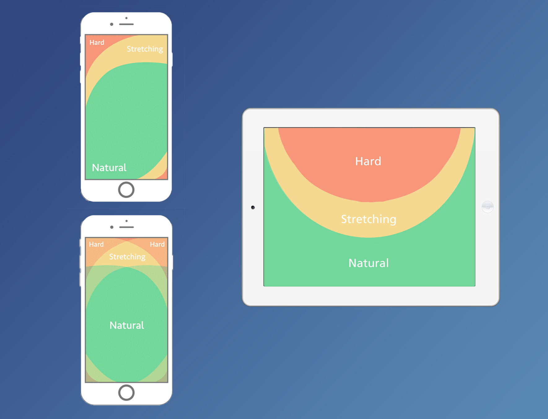
Comfortable Reach & Layout
In concepting the layout and touch target placement, it was important to consider general best-practices when it comes to single and dual-hand reachability on phone and tablet devices.
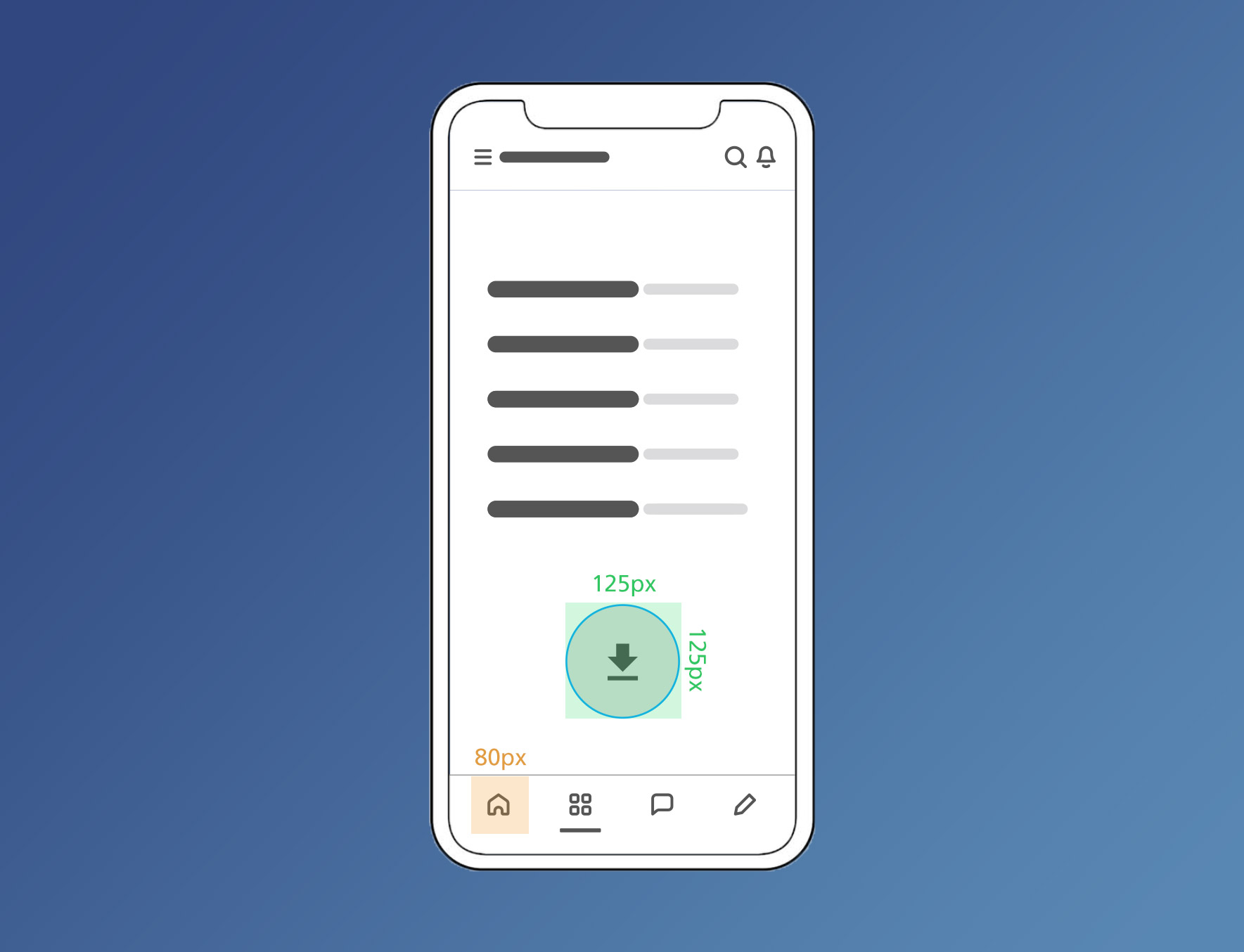
On-the-Move Touch Target Priority
Touch target areas that are too small increase user frustration and overall error rate. Average index fingers are 45-57px and the average adult thumb is 72px. Ensuring these sizes for all interactive UI can be tricky on phones, but given the context in which attendants will be using the app it was important to make critical elements very easy to find and touch with ease.
Solution Approach
Based off of the initial user insights and general business goals, the approach for the solution summed up nicely - keep it simple. This would be applied in a few different aspects, but simplifying as much as possible, wherever possible was the focus for developing a design solution.
Design Strategy
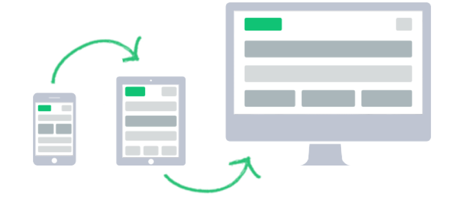
Houskeeping attendant journeys showed their end-to-end workflow to be relatively straight-forward, with management and other user roles needing a little bit more control. As a result, it made sense to use the 'Mobile First' approach. By focusing first on the smallest device with, with the simplest workflow, it would help in the general approach of 'keeping it simple.'
In the spirit of 'Progressive Enhancement,' with added device processing power and screen real-estate, housekeeping managers could leverage functionality and added interactivity on a tablet device that was already established initially for phone devices.
Initial Ideation
Starting off, some conceptual sketches and potential interaction workflows were put together to begin getting an idea of how to address all target user and business needs. As mentioned before, the key user pain points to account for were:
- Time and performance tracking
- Zone cleaning efficiency
- General communication and operational insights
The main business/brand requirement to keep-in-min was to leverage Bluetooth LTE to lock/unlock rooms instead of relying on physical keys.
One idea that surfaced blended together the Bluetooth technology requirement and the time and performance tracking need at the same time. After 'requesting' the key needed to unlock the door when within a certain range of a door lock, time tracking would begin on the room upon successful entry.
Another idea, once inside the room where most pain points existed, was to provide a checklist of necessary steps attendants take (also could include statistical time reference), depending on the room type, making sure cleaning effeciency is front-of-mind while also keeping an eye on time spent relative to how much time it historically takes.
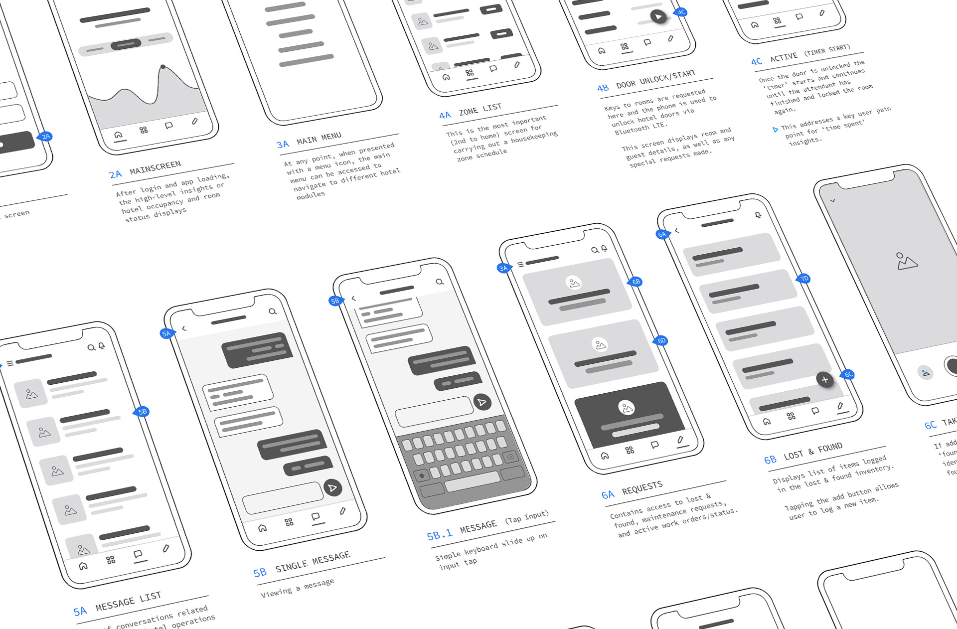
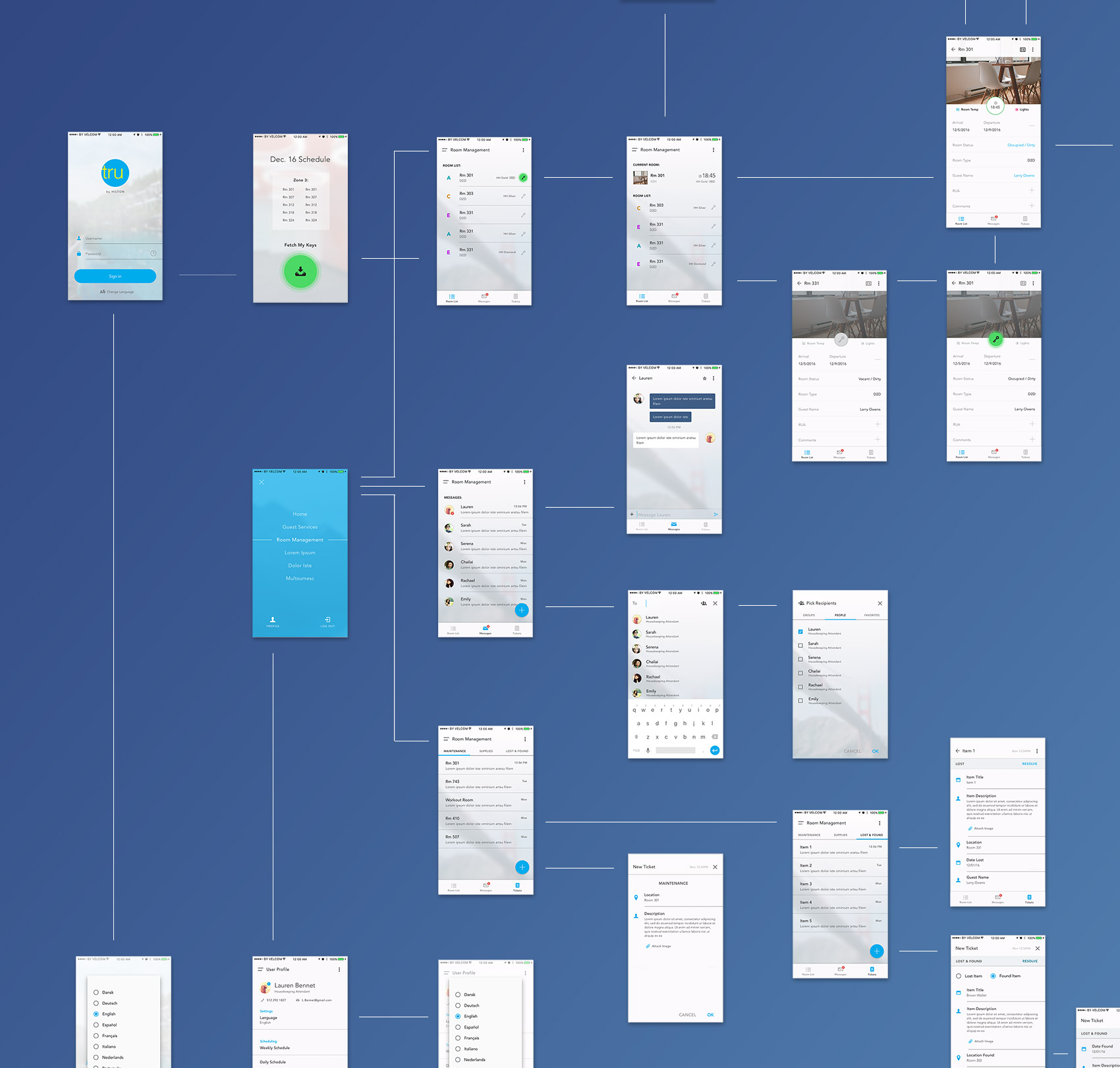
Wires & Interactions
After getting a good idea of some features and workflows that should help address some key pain points, low-fidelity wires were put together. This helped to further flesh out a better overall navigation structure, as well as how various screens could be constructed. High-level annotations helped document exactly what problem certain features or screens were looking to solve, as well as quickly communicate purpose and intent.
Visual & Interaction Solution
In terms of the visual style, aesthetic, and interaction behaviors, I wanted to stick with the recurring theme from the solution approach in 'keeping it simple.' Words like 'clean and minimal' seemed (and still does often) to be the style for every product design. Around the time the project was done, a new, monochromatic trend had emerged which was being embraced by companies such as Apple, Spotify, Instagram, and AirBnB.
This 'Complexion Reduction' methodology focused on larger, bolder headlines, removing unnecessary imagery and color and simplifying icons to make them more universally recognizable. What was left was a very black and white UI where the content shined and functionality was clear.
While this might seem like another UI trend back in 2016, it did align with the design approach and strategy and was the inspiration behind the visual style.
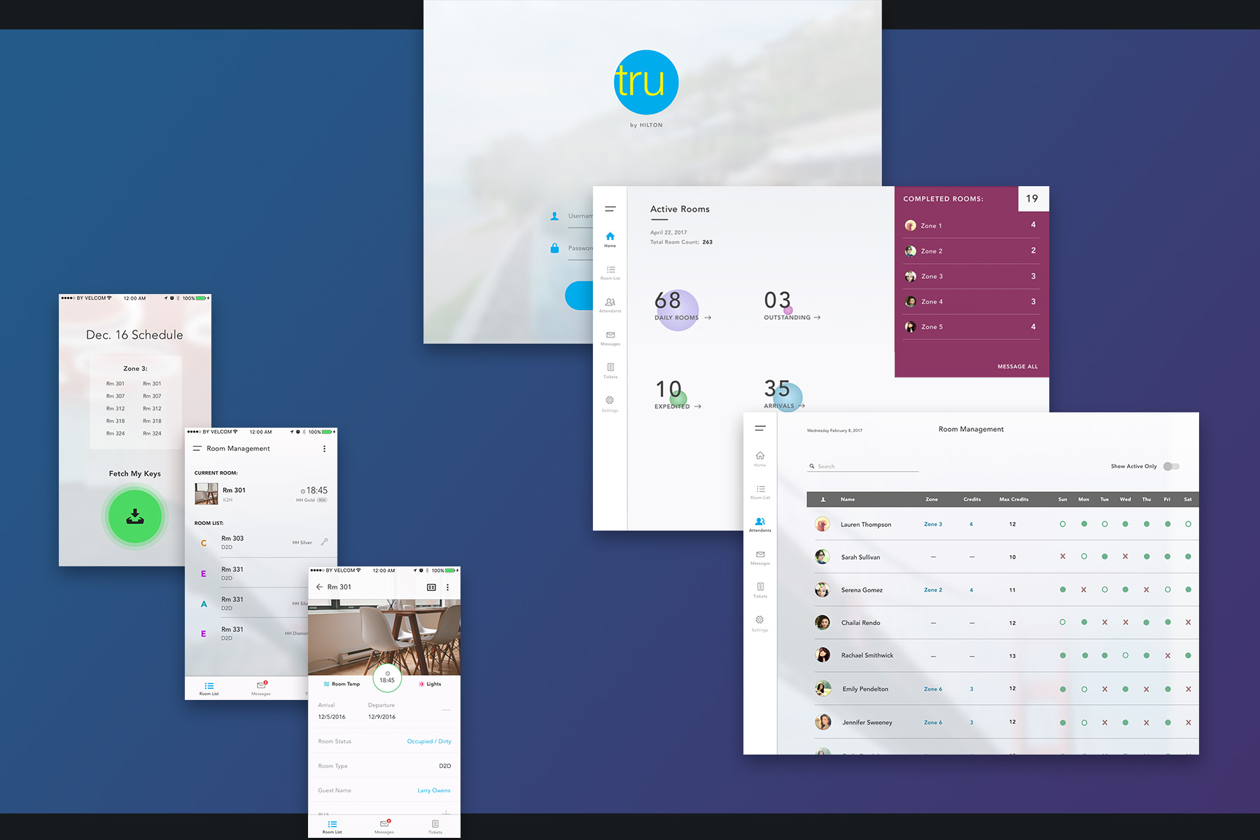
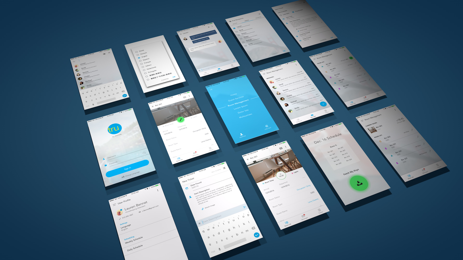
Housekeeping Attendant Workflow
The new workflow for housekeeping attendants ended up with a few adjustments when it came around to final UI design, but largely followed the wires developed.
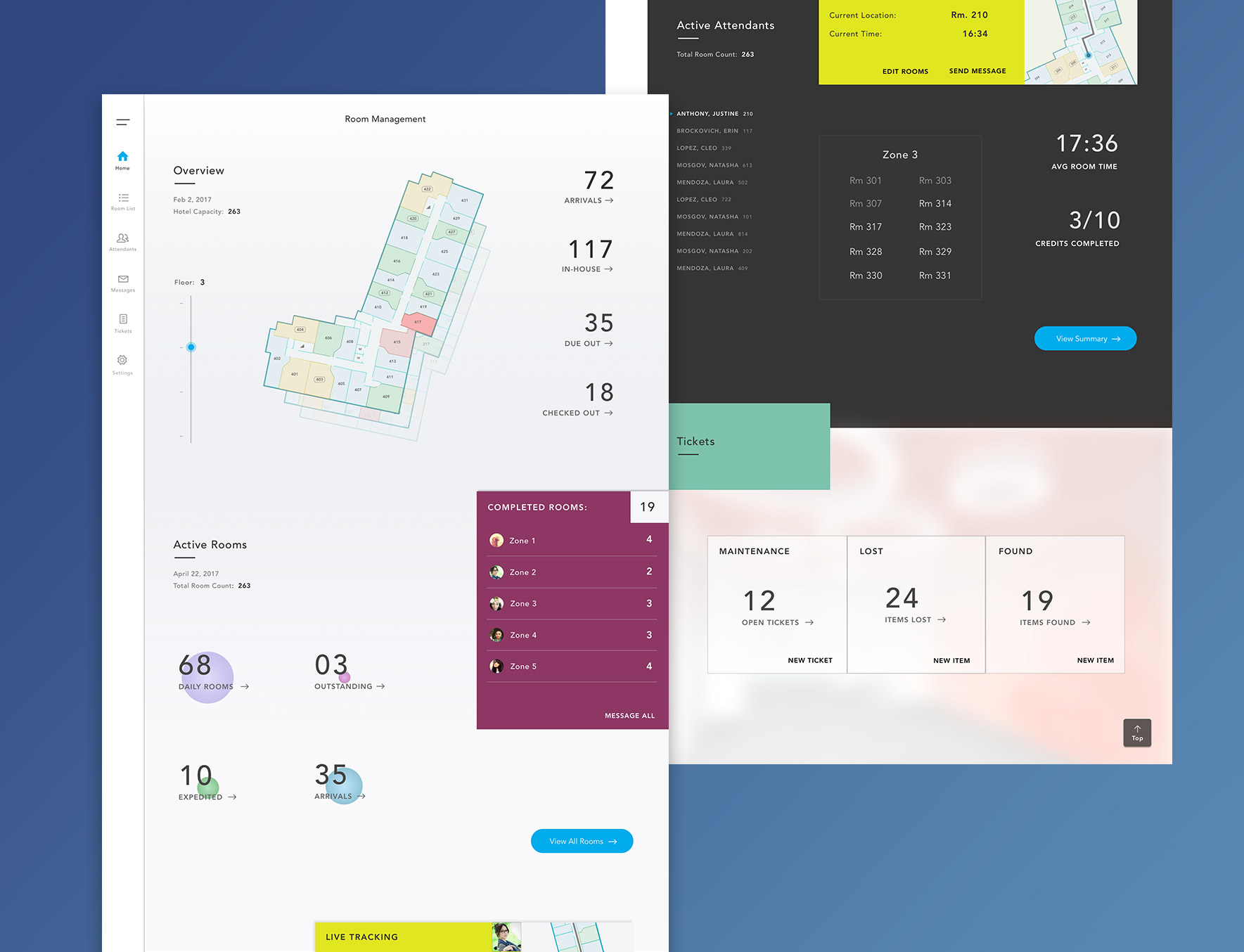
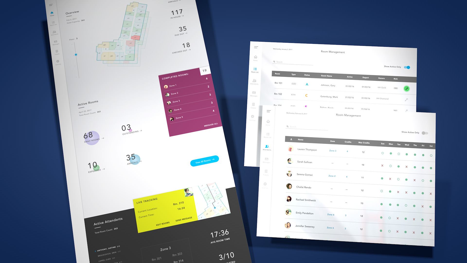
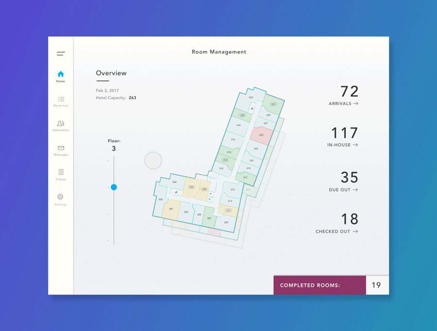
Housekeeping Manager Solution
The interface for tablet devices included a lot more insights needed for more effectively managing operational tasks - identified as a pain point previously. Interactive room/floor statuses, live attendant tracking, quick zone adjustments, and real-time hotel maintenance and housekeeping insights were all features included in the tablet solution.
Connected Interaction Animations
Transitions and animations align mostly with Material Design, moving key elements around in a subtle way that stresses contextual transition on the element being interacted with, rather than over-the-top flash. This was how 'keeping it simple' translated in the interactions.
Project Reflection
Looking back on the project, there were certainly some retrospective thoughts that would have been useful on the initial end-to-end iteration.
- Research sample groups could have been larger, but the initial research and analysis phase focused on explorative user discovery should have been longer. This was due to budget and project timeline.
- Certain gates and touchpoints, after analysis and ideation direction/strategy, only included internal project managers and stakeholders. It would have been better to have time and bandwidth for some iterative user feedback sessions before proceeding through to final UI design.
- Lastly, the internal process would have benefitted from earlier collaboration with engineers. The development process seemed fairly 'waterfall,' with intent and rationale not being clear cross-functionally as much as it could have.